
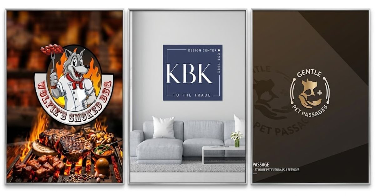
San Antonio rewards businesses that have a clear story. Visitors fill the River Walk and the Missions throughout the year, families have supported neighborhood restaurants and shops in Southtown, Alamo Heights, and the Westside for generations, and new residents keep arriving through the military bases, the medical center, and a growing technology and bioscience sector. For a small business owner, that mix of loyal locals, curious visitors, and newcomers is a real opportunity. It is also a crowded field, because every taquería, boutique, law office, roofing contractor, and fitness studio is competing for the same attention.
In that environment, a logo is often the first thing a potential customer notices and the thing they are most likely to remember. Professional branding logo design in San Antonio gives a small business a visual identity that is distinct, flexible, and built to last, rather than a quick graphic that looks like a hundred others. This article explains how a professionally designed logo supports brand recognition, how it becomes the anchor of a larger brand identity, and what San Antonio business owners should know before they invest in one.
Why Brand Recognition Matters in a Market Like San Antonio
Brand recognition is the ability of a customer to identify a business from its visual or verbal cues alone. When someone sees a color combination on a delivery van, a mark on a coffee cup, or a symbol on a yard sign and immediately knows whose business it is, recognition has done its job. That moment of instant identification shortens the path to a purchase, because the customer does not have to stop and evaluate an unfamiliar company. They already have an impression, and if the impression is positive, the business starts the relationship ahead of its competitors.
San Antonio adds several conditions that make recognition especially valuable. Word of mouth carries great weight here, and a business that is easy to describe and easy to spot is easier to recommend. A customer who says “the place with the blue tile mark on the corner of the building” is giving a referral that works only if the mark is memorable. The city also has a steady calendar of events, including Fiesta, festival weekends, farmers markets at the Pearl, and Spurs game days, where small businesses set up booths, sponsor teams, and hand out printed materials. At each of those moments, a recognizable identity helps people connect what they see at a booth with the storefront they pass on the way to work.
Customers also find local businesses in several different ways at once. They drive past signage on Loop 410, I-10, or Highway 281, they scroll through Instagram, they search Google Maps for “near me” results, and they open text messages from friends with a link. A brand has to look like the same business in every one of those places. A professionally designed logo is the tool that makes that possible.
What a Logo Does, and What It Does Not Do
A logo is a compact visual signature. It identifies the business, separates it from competitors, and gives customers something to attach their experiences to. It does not, by itself, create loyalty or guarantee sales. A logo cannot repair slow service or an unclear offer. What it can do is make sure that every good experience a customer has is stored under a mark that is easy to recall and easy to find again.
It helps to separate three terms that are often used as if they meant the same thing:
- Logo. The mark itself: a symbol, a wordmark, or a combination of both.
- Brand identity. The full visual and verbal system built around the logo, including colors, typography, imagery, patterns, and tone of voice.
- Brand. The overall perception customers hold about the business, shaped by every interaction they have with it.
A business controls the first two directly and influences the third over time. The logo is where the work begins, because every other part of the identity is chosen to support it.
A well-made logo performs several jobs at once. It tells customers what kind of business they are looking at before they read a word. It signals the level of care and quality they can expect. It gives employees, vendors, and partners a shared symbol of the business. It also creates a fixed point of consistency, so that signage, packaging, advertising, and social media can all be built from the same visual foundation.
Professional Logo Design Compared With Template and Do-It-Yourself Logos
Online logo makers and template marketplaces are tempting, especially for a new business with a tight budget. They are fast and inexpensive, and for a short-term project such as a one-time event, they may be enough. For a company that expects to operate in San Antonio for years, the limits of those tools tend to appear quickly.
- Lack of distinctiveness. Templates are used by many buyers. A logo built from a stock icon and a common font can look nearly identical to another business in the same category, sometimes in the same zip code.
- Poor performance at different sizes. A design that looks good on a laptop screen may turn into an unreadable smudge when it is shrunk to a social media avatar or stitched onto a shirt pocket.
- Limited file formats. Many quick logo tools deliver only low-resolution images. A sign shop, a vehicle wrap installer, or a printer needs vector files that scale without losing sharpness.
- Unclear ownership. Some template services license the artwork instead of transferring it, which can limit how the business may use, modify, or protect the mark.
- Trademark risk. A design assembled from widely available elements is difficult to protect, and it may resemble an existing mark closely enough to cause a dispute.
- No system behind it. A template gives the owner a picture, not a plan for how to use it. There is no guidance on color values, spacing, or approved variations.
The hidden cost shows up later. A business that outgrows an inexpensive logo has to redesign it, reprint materials, replace signage, and rebuild whatever recognition it had started to earn. Starting with a professional design avoids that reset.
How the Professional Design Process Works
A professional designer does not begin by drawing. The process starts with understanding the business, and each stage narrows the possibilities until the final mark is clearly the right one.
- Discovery. The designer learns about the owner’s goals, the customers the business serves, the products or services offered, the tone the business wants to project, and the reasons customers choose it. Good discovery also includes the practical details: where the logo will appear, how it will be produced, and which sizes matter most.
- Market and competitor research. The designer reviews other businesses in the same category and the same local market. The goal is to identify visual patterns that are overused so the new logo can stand apart, and to find open territory that suits the business.
- Concept development. Several distinct directions are sketched and refined. Each one reflects a different idea about how the business could be represented, whether through a symbol, a custom wordmark, a monogram, or an emblem.
- Presentation and feedback. The concepts are shared with an explanation of the reasoning behind them. The owner responds based on how well each concept fits the business and its customers, not only on personal taste.
- Refinement. The selected concept is polished. Proportions are adjusted, letterforms are fine-tuned, colors are tested, and the mark is checked at small and large sizes and in one-color versions.
- Delivery. The finished logo is delivered as a complete set of files, ideally including vector formats for print and signage and web-ready formats for digital use, along with color specifications and basic usage guidance.
This structure protects the business from a common problem, which is choosing a logo because it looks appealing at first glance without testing whether it works in real conditions.
The Design Decisions That Build Recognition
Symbol and Shape
Shapes are processed quickly and remembered easily. A distinctive symbol, or a wordmark with a memorable custom detail, gives customers a handle to hold onto. Designers consider whether the form should feel solid or fluid, sharp or rounded, formal or casual. A law firm and a taco truck have different needs, and the shapes they use should reflect that difference. The strongest marks are simple enough to be drawn from memory, which is a useful test for any small business owner to apply.
Color
Color is often the first element a customer registers, and it carries emotional associations that influence first impressions. San Antonio offers a rich palette of local inspiration, from the warm terracotta of Spanish colonial architecture to the bright, saturated tones of Fiesta and the cool blues of the river and the sky. These can be effective starting points, but color choices should be driven by strategy. A designer will look at what competitors in the same category are already using and recommend colors that help the business stand out. If every dental office nearby uses the same shade of teal, another teal logo will disappear into the crowd.
A professional will also define the exact color values for print and screen, so that the brand’s orange does not look like three different oranges across a sign, a brochure, and a website.
Typography
Lettering communicates personality before the words are read. A refined serif suggests tradition and trust, a clean sans-serif feels modern and approachable, and a hand-drawn script can add warmth for a bakery or boutique. Typography is also a practical matter. The typeface has to remain legible on a small business card, a distant billboard, and a mobile screen. In a bilingual city, it should also handle accented characters such as á, é, í, ó, ú, and ñ correctly, so that a Spanish name or tagline looks as polished as an English one.
Simplicity and Versatility
Overly detailed logos fail where it matters most. Fine lines vanish in embroidery, gradients cause problems in single-color printing, and intricate illustrations become muddy in small digital spaces. A professional designer builds in flexibility from the beginning, testing the mark in black and white, on dark and light backgrounds, and at very small sizes. A logo that holds up in every condition will be seen more clearly and recalled more reliably.
Designing With San Antonio in Mind
A logo for a San Antonio business does not need to include the Alamo, a star, or a cactus. Those symbols are common, and they can make a business look like every other company drawing on the same imagery. The more effective approach is to let local character show up in subtle ways, such as the geometry of papel picado, the arches and rhythm of Spanish colonial architecture, the curve of the river, or the color relationships found in talavera tile. A thoughtful designer can translate a sense of place into the design without relying on obvious visual shortcuts.
Several local conditions deserve careful attention:
- A bilingual and bicultural customer base. Many San Antonio customers move easily between English and Spanish. The logo, tagline, and supporting materials should read well in both, and the name should not create awkward results when translated or mispronounced.
- Different audiences by location. A business near the River Walk or the Pearl is likely to attract tourists, so a mark that communicates the offer at a glance matters. A business in a residential neighborhood relies more on local trust and repeat visits, and a friendlier, more personal identity may be a better fit.
- Trades and service businesses. Contractors, cleaners, landscapers, and mobile service companies spend a great deal of time on the road. Their logos need to be readable on a moving vehicle, a magnetic door sign, or a yard sign seen from a distance.
- Military and healthcare communities. San Antonio has a large population connected to the military and to healthcare. Businesses serving those groups often benefit from an identity that communicates reliability, professionalism, and clarity.
- Protected local marks. Imagery tied to professional sports teams, the city’s institutions, and well-known events may be protected. A professional designer will steer clear of anything that could create legal problems.
From Logo to Complete Brand Identity
A logo becomes far more powerful when it is part of a system. A brand identity takes the logo and surrounds it with a defined set of visual and verbal rules, so that every piece of communication feels connected. A complete identity for a small business typically includes:
- A primary logo along with secondary versions, such as a horizontal layout, a stacked layout, and a compact icon for small spaces
- A color palette with exact values for print and digital use
- Primary and supporting typefaces, with guidance on how to use each
- Graphic elements such as patterns, icons, or textures that extend the look beyond the logo
- Direction for photography and imagery
- Guidelines for tone of voice, including how the business writes and speaks to customers
- Rules for correct use, including minimum size, clear space, and what not to do
These elements are usually collected in a brand style guide, which can be a simple document of a few pages for a small business. It gives employees, freelancers, printers, and marketing partners one reference point. Without it, a brand gradually drifts as different people make small, well-meant changes.
Once the identity is defined, it can be applied consistently to storefront signage, vehicle graphics, menus, packaging, uniforms, business cards, invoices, estimates, email signatures, social media profiles, the website, and the Google Business Profile. The more places the same identity appears, the faster customers start to connect those touchpoints as one business.
How Consistency Turns a Logo Into Recognition
Recognition does not come from a single impression. It builds through repeated exposure to the same visual signals. Consider a hypothetical landscaping company in Stone Oak. A homeowner sees its truck on a morning commute, notices its sign in a neighbor’s yard a few days later, and then comes across its social media post about a patio project. If the logo, colors, and typography are the same each time, the homeowner begins to treat these as one familiar business. If each appears in a slightly different style, the connection is weaker, and the business has to start over with each new impression.
Inconsistency usually enters in small ways. A printer adjusts a color, someone stretches the logo to fit a space, a social media manager uses an older version, or a vendor recreates the mark from a low-quality image. Over time, those small differences add up to a diluted brand. A professional logo package with clear files and usage rules makes it easy to get things right and hard to get them wrong.
Consistency also supports trust. Customers tend to read a polished, uniform presentation as a sign of an organized, dependable business. A mismatched presentation can raise doubts, even when the service itself is excellent.
Building Recognition Online
For most small businesses, the first interaction with a new customer now happens on a screen. A professional logo should be designed with that reality in mind. This means preparing versions that work in the following places:
- A website header, where a lightweight vector file keeps pages loading quickly
- Social media profile photos, which are usually cropped into small circles or squares
- A browser favicon, which may be only 16 pixels wide
- The Google Business Profile, where the logo appears beside reviews, photos, and map listings
- Email signatures, online ads, and digital invoices
- Light and dark mode interfaces, which call for versions that remain visible on both backgrounds
A consistent visual identity also supports local search efforts. When a business uses the same name, logo, and visual style across its website, directory listings, social accounts, and review sites, customers can confirm that they have found the right company. That reassurance matters when someone is choosing between several similar options in a list of search results.
What Professional Logo Design Costs and What It Returns
Price is a fair concern for any small business owner, and a professional logo is an investment. The useful question is not how little a logo can cost but how long it will serve the business and how well it will perform during that time. A strong logo is used on every sign, every vehicle, every package, every web page, and every advertisement the business produces. Spread over years of use, the cost per impression is small.
The less visible costs of a weak logo are larger. They include reprinting materials after a redesign, replacing exterior signage, losing recognition that took years to build, and missing sales to competitors who simply looked more credible. There is also the cost of delay. A new business that needs to open on schedule cannot wait months for a brand identity, which is why turnaround time is worth discussing with any designer. Many owners find that a capable team can deliver quality work on a rush timeline without cutting corners on research and craftsmanship.
Odyssey Design Co. describes the value of working with specialists this way:
“If you’re looking for a cost-effective way to enhance your brand’s online presence in San Antonio, order a design concept, hire a team of expert logo designers who are motivated, creative, and skilled at delivering even rush projects with exceptional efficiency.”
How to Choose a Logo Designer in San Antonio
The right designer or studio makes the process smoother and the result stronger. Before committing, a business owner should consider these questions:
- Does the portfolio show range and relevance? Look for work in the designer’s logo portfolio that is distinct from one project to the next, suggesting that the designer responds to each client’s unique needs instead of applying a formula. Experience working with small businesses in similar industries is also a plus.
- Is there a clear process? A professional should be able to explain how discovery, research, concept development, and revisions work, and what the owner is expected to contribute.
- Who owns the final artwork? The agreement should state that full rights transfer to the business once the project is paid for, so the owner is free to use, modify, and protect the mark.
- Which files are included? The package should contain vector files, high-resolution images, and versions for different backgrounds and uses, so that sign makers, printers, and web developers can work without delay.
- How many revisions are included? Clear expectations prevent disagreements later. A reasonable number of refinements should be part of the standard scope.
- What is the timeline? Ask about the typical schedule and whether faster delivery is available when a launch date is fixed.
- Is the work original? The designer should confirm that the logo is created from scratch and is not assembled from stock art or copied from another source.
- Will brand guidelines be provided? Even a short guide to colors, fonts, and usage rules saves time and protects consistency.
- How well does the designer communicate? Prompt, clear responses during the first conversation are a good sign of how the project will go.
Common Mistakes to Avoid
Business owners who invest in a logo can still reduce its value through avoidable errors. The most frequent ones include:
- Following trends too closely. A style that is popular this year may look dated in three. Timeless forms last longer than fashionable effects.
- Adding too much detail. Every extra element makes the mark harder to remember and harder to reproduce.
- Using too many colors. A limited palette is easier to apply consistently and more likely to be remembered.
- Skipping research. A logo chosen without looking at competitors can accidentally resemble them.
- Designing only for one use. A mark that looks good on a website but fails on a truck door or a one-color receipt is incomplete.
- Making decisions only on personal preference. The owner’s favorite color or style may not be the one that appeals to customers.
- Changing the logo too often. Recognition depends on repetition. Frequent redesigns reset the process.
- Failing to document the rules. Without usage guidelines, even a great logo will gradually be applied inconsistently.
Conclusion
For a small business in San Antonio, a professionally designed logo does far more than decorate a storefront or a website. It gives customers a reliable way to identify the business, supports word-of-mouth referrals, signals quality at first glance, and provides the foundation for a complete brand identity. When that identity is applied consistently on signs, vehicles, packaging, social media, and search listings, recognition builds steadily, and each new impression strengthens the ones before it.
The city’s blend of tradition, culture, tourism, and rapid growth gives local businesses a rich source of inspiration and a demanding set of audiences. A designer who understands the market, researches the competition, and builds a flexible system of files and guidelines can help a small business meet those demands with confidence. Taking the time to do this well at the start is one of the most practical steps an owner can take toward a brand that customers recognize, remember, and return to for years.
