
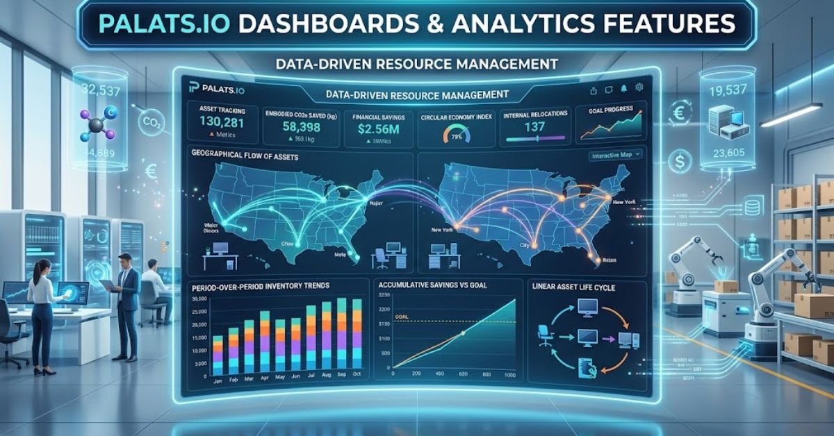
Optimizing operational workflows requires clear, structured visibility into resource movement, asset life cycles, and organizational output. Palats.io provides built-in dashboards and analytics features built specifically to give asset managers, operations leads, and sustainability teams complete control over their physical inventory.
Instead of wrestling with static spreadsheets or disconnected enterprise systems, teams use the Palats platform to convert day-to-day asset operations into structured visual intelligence.
1. Core Architecture of Palats.io Analytics
The analytical Engine in Palats divides data into target operational buckets: Events Data (tracking movement and operational actions) and Distribution Data (tracking current asset status and categorical allocations).
                      ┌──────────────────────────────────────┐
                      │    Palats.io Central Data Hub        │
                      └──────────────────┬───────────────────┘
                                         │
                 ┌───────────────────────┴───────────────────────┐
                 ▼                                               ▼
    ┌─────────────────────────┐                     ┌─────────────────────────┐
    │   Event-Based Reports   │                     │  Distribution Reports   │
    │ (Movements & Lifecycle) │                     │ (Inventory Status/Alloc)│
    └────────────┬────────────┘                     └────────────┬────────────┘
                 │                                               │
  ┌──────────────┼──────────────┐                 ┌──────────────┼──────────────┐
  ▼              ▼              ▼                 ▼              ▼              ▼
Stacked      Accumulative     Flow /            Pie           Data           Input
Bar Chart    Line Chart     Geographic         Chart       Breakdown         Data
Dynamic Event Reports vs. Static Distribution Reports
- Event Reports: Track dynamic shifts over time. Every time an item moves, changes hands, gets archived, or changes operational status, an event log records it.
- Distribution Reports: Provide a real-time snapshot of static inventory allocations across building locations, project phases, or material categories.
Granular Filtering and Tag-Based Segmentation
- Segment reporting using internal operational tags (e.g., items marked as Sold, Missing, or Reused Internally).
- Isolates specific project phases without skewing baseline historic data.
- Applies non-destructive live filters without modifying underlying database records.
2. Deep Dive: Key Visualizations & Analytics Features
Palats offers five native visualization models customized for inventory control, logistics tracking, and circular asset management.
Stacked Bar Charts
Stacked bar charts serve as the default view for event activity across custom time frames.
- Primary Function: Measures operational activity broken down by day, week, or month.
- Granular Dimensioning: Evaluates overall activity volume while breaking down segments by variables like item category, origin site, or target deployment area.
- Best Used For: Comparing month-over-month resource reallocation velocity.
Accumulative Stacked Line Charts with Goal Tracking
This visualization compounds event counts over time rather than resetting every time interval.
- Goal Baseline Overlay: Adds a customizable target marker (represented by a visible benchmark line) directly to the visualization interface.
- Progress Tracking: Shows real-time trajectory curves against organizational target goals for asset reuse or redistribution.
- Interactive Tooltips: Displays absolute volume to date alongside exact step-change adjustments.
Flow Charts (Relocation Dynamics)
Selecting Location Before and Location After dimensions activates the native Flow Chart interface.
[ Origin Site A ] ─── (50 Items) ───► [ Central Hub ] ─── (30 Items) ───► [ Target Site B ]
- Movement Visualizer: Maps item transfers across locations.
- Multi-Move Calculations: Logs sequential transfers per item without double-counting static inventory totals.
- Bottleneck Identification: Pinpoints operational stages where physical assets stall in transit.
Geographic Flow Maps
For multi-site enterprises, Geographic Flow translates spatial data onto an interactive map interface.
- Spatial Velocity Vectoring: Displays physical movement lines between geographic coordinates.
- Volume Scaled Rendering: Dynamically adjusts connector line thickness based on transfer volume.
- Regional Logistics Analysis: Identifies high-volume logistics corridors between regional facilities.
Distribution Pie Charts & Dual Data Tables
Distribution data relies on customizable pie charts paired with dynamic tabular breakdowns below the canvas.
- Data Breakdown View: Grouped, segmented values aligned directly with chart sections.
- Input Data View: Raw, line-item inventory inputs for audit validation and line-item export.
3. Comparison of Visualization Models
| Feature / Chart Type | Primary Data Type | Operational Purpose | Key Metric Tracked |
| Stacked Bar Chart | Event Logs | Time-interval volume breakdown | Activity counts per time frame |
| Accumulative Line Chart | Event Logs | Target tracking & progress monitoring | Cumulative output vs. set goal |
| Flow Chart | Location Events | Internal supply chain tracking | Relocation volume between nodes |
| Geographical Flow | Spatial Events | Regional asset distribution | Cross-facility transfer velocity |
| Distribution Pie Chart | Inventory Snapshots | Asset allocation breakdown | Categorical percentage totals |
4. Practical Implementation: Step-by-Step Reporting Setup
Setting up actionable tracking in Palats requires configuring the setup parameters correctly from the start.
Step 1: Navigating to the Analytics Suite
- Log into your dashboard portal at
palats.app. - Select Analyze from the main left-hand navigation menu.
- Click Create Report in the top right corner to start a custom query workspace (or select a pre-configured template).
Step 2: Defining Dimensions and Breakdowns
- Choose between Event Reports or Distribution Reports in the primary configuration box.
- Select your core Dimension to Analyze (e.g., Article Category, Item Status, or Department Owner).
- Set your Select Breakdown parameter to establish secondary color-coded variables across data points.
Step 3: Filtering & Date Formatting
- Apply Type of Event tag constraints to exclude noise (e.g., filter specifically for Reused Internally).
- Click Custom Time Frame to pick your target date boundaries.
- Toggle between the top visual chart and the bottom Input Data table to verify raw asset accuracy before exporting.
5. Troubleshooting & Data Hygiene Best Practices
Even robust analytics dashboards yield unreliable metrics if the underlying data feed contains structural errors.
                       ┌──────────────────────────────┐
                       │   Data Ingestion Checkpoint  │
                       └──────────────┬───────────────┘
                                      │
            ┌─────────────────────────┴─────────────────────────┐
            │ Are Location Tags and Event Types Standardized?   │
            └────────────┬─────────────────────────┬────────────┘
                         │                         │
                     [ YES ]                    [ NO ]
                         │                         │
                         ▼                         ▼
            ┌─────────────────────────┐┌─────────────────────────┐
            │ Validated Analytics     ││ Data Discrepancy Risk:  │
            │ Clean Flow Visuals &    ││ - Duplicate Flow Counts │
            │ Accurately Tracked Goals││ - Misaligned Cumulative │
            │                         ││   Goal Tracking Curves  │
            └─────────────────────────┘└─────────────────────────┘
Resolving Multi-Move Event Inflation
Because Flow Charts log total movements rather than static item counts, an asset moved three times appears as three discrete event actions.
- The Fix: Switch the bottom tab view from Data Breakdown to Input Data. Filter by unique Asset ID to calculate unique physical items versus total relocation actions.
Correcting Accumulative Trend Errors
If your cumulative line flattens unexpectedly, tag omissions are usually the culprit.
- The Fix: Check your Type of Event filter parameters. Ensure newly created status tags are explicitly enabled inside the report’s active filter settings.
6. FAQ
Common Features of Dashboards
Dashboards typically feature real-time data integration, interactive filtering, visual charts/graphs, and drill-down capabilities to simplify complex metrics into actionable insights.
The Four Types of Dashboards
The four primary types are strategic (executive oversight), operational (daily workflows), analytical (deep data exploration), and tactical (project and mid-term goal tracking).
Key Components of a Dashboard
Key components include visual chart widgets, high-level KPI scorecards, dynamic filtering controls, header toolbars, and underlying data connectors.
How to Create a PMO Dashboard
Define your core project management metrics (budget, health, timelines), aggregate source data from your project tools, and design clean visual scorecards using a BI platform like Power BI, Tableau, or Excel.
Can ChatGPT Create a Dashboard?
Yes; while it cannot host live production software, ChatGPT can generate full dashboard code (HTML/JS, Python Streamlit, SQL/DAX scripts) and create interactive analytical chart previews from uploaded dataset files.
read more: How Many Keys on a Full Size Keyboard? (2026 Guide)/How Often Should Bixiros.5a8 Software Be Updated? (Guide)
